Grow with Balance Sheet Protection
Let Oculus optimize your oil & gas asset strategy today.
Oculus has purchased over 2,400 wells while evaluating every major US basin. This extensive experience allows us to help you grow in three ways:
1. Purchase your Non-Operating wells
2. Help your team evaluate assets
3. Recommend your next transaction using The Best Growth Model
Asset Evaluation
If you overestimate the market value of assets, the associated debt will damage your Balance Sheet.
The Oculus Team has been evaluating the market value of oil and gas wells since 1981 and we can help you determine an accurate market value of an asset by drawing on our decades of specialized expertise in petroleum engineering and business.
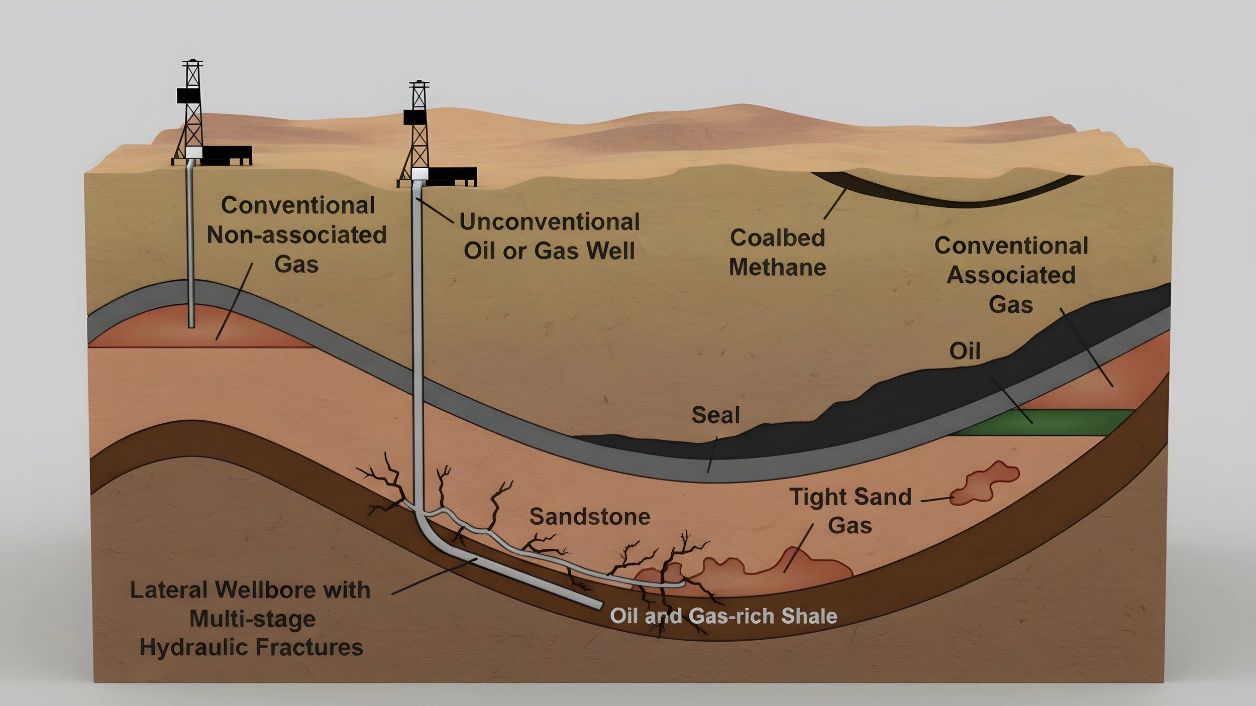
Our engineering expertise covers vertical wells, horizontal wells, tight sands, coalbeds, shales, pressure maintenance, reservoir simulation and all types of enhanced oil recovery.
Our business expertise covers financial models, oil prices, gas prices and fiat currency value decline.
Next Transaction
If your next transaction adds too much debt, it will damage your Balance Sheet and you run the risks of:
paying too much interest
replacing management
going out of business
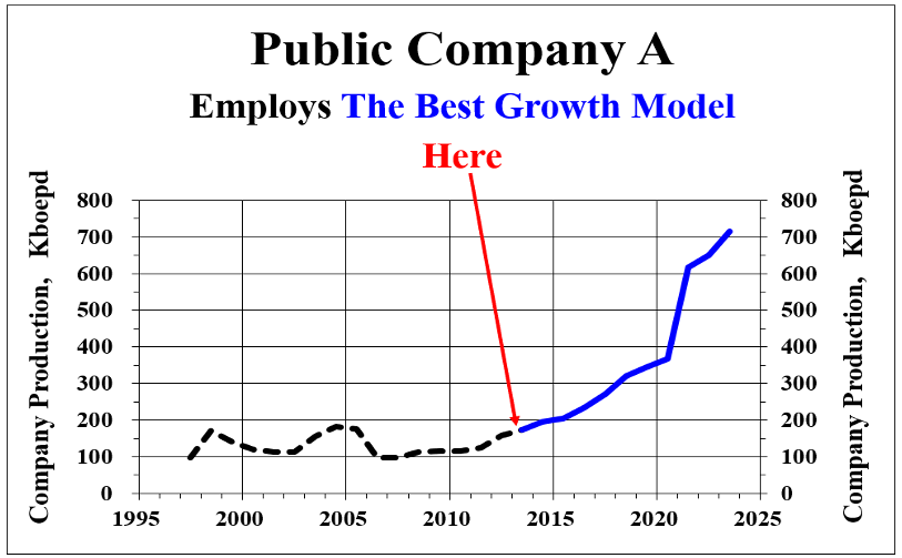
To help you avoid too much debt, Oculus will reveal to your team how the best oil companies grow using what we call The Best Growth Model which prohibits excessive debt. Note the dramatic growth achieved by Public Company A when it switched tactics.
Oculus will also recommend Your Next Transaction using this model.